Post Docs: Talking Trash (Culture) with the Visualists Behind Double Dagger and Black Dice.
Last summer, Soundscreen Design debuted The Artist Music Journal, a limited-run book series. For each […]

Post Docs: Talking Trash (Culture) with the Visualists Behind Double Dagger and Black Dice.
Last summer, Soundscreen Design debuted The Artist Music Journal, a limited-run book series. For each […]

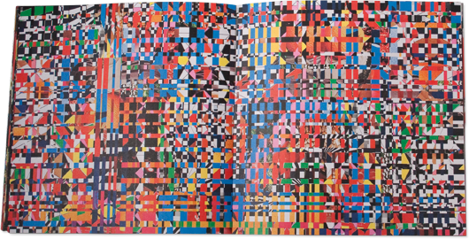
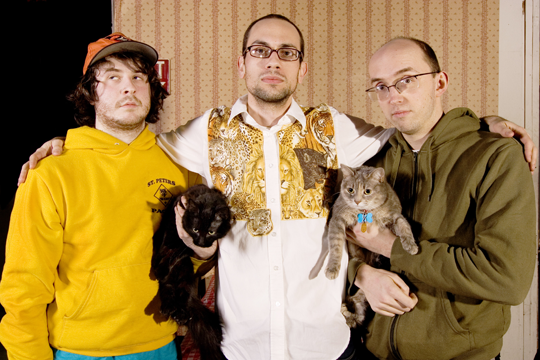
Last summer, Soundscreen Design debuted The Artist Music Journal, a limited-run book series. For each edition, a visual artist or musician puts together a 24-page book drawing inspiration from their connection to music. The two latest entries were made by Baltimore’s Post Typography (a.k.a. Nolen Strals and Bruce Willen, also of the band Double Dagger [pictured below]) and Bjorn Copeland, founding member of experimental noise outfit Black Dice. Here, Post Typography quizzes Copeland on his involvement in the series, his process, and the effect of his small-town roots.
Post Typography: What were you trying to create with your AMJ volume?
Bjorn Copeland: I was basically trying to paint a picture of the way I see my relationship to art and music. Black Dice has a lot to do with that. It’s been a 12-year project that has been the outlet for all of our ideas. I tried to make as much new imagery for it as possible. There are a few older pieces that seemed to fit, so that’s why they’re there.
Collage has been a part of punk and independent music since the beginning. Has this history had an influence on your own work, either in the choice to use collage as a medium or in the content?
As soon as I got into music, I loved album artwork. That hasn’t really stopped. Collage always appealed to me, especially all the Vermiform [Records] shit. I love the way their releases look. They all seemed to be snapshots of some bizzaro parallel world. It really colored the way I thought of the music. That seems like an opportunity that a lot of people shy away from.
Do you see a connection in the way you approach your music and visual art?
It’s really the same to me. Even when I work independently from [my brother] Eric and Aaron [Warren, also in Black Dice], the things that we talk about when doing band shit resonates in my head, and is a huge influence. I’ve really tried to keep a cohesion between the two.

Which books have been your favorites in the AMJ series so far?
I really liked yours. It’s fun to read. I kept searching for the poster you did for us, Melt Banana, and Heroin Sheiks at the Auto Bar. Remember that one? Maybe that was pre-Double Dagger. Still got that one. Black Dice has been talking about doing a flyer book with comment on each show. Not sure what I remember about a lot of them, but it seems like it would be entertaining to flip through. Though our visual output is really different, both of our work references or borrows from low-rent pop culture. We all grew up in small towns where that was about the only kind of culture that was offered.
What draws you to mundane objects/imagery as sources for your work?
I really like using things that are so familiar that you are almost numb to them. I also treat that type of source material a lot less preciously. Since I make everything by hand, it’s easy to fuck up in a way where you can’t fix it. You know, you can’t erase it, or unglue what you stuck together. I rarely go out and look for source material, I just sort of acquire shit over time. I love having a huge mess to work in. Wherever you look, you see something you glossed over before. The small-town culture you’re talking about happens to be the stuff we all were exposed to the most growing up, so it seems like an honest starting point.
Post Typography’s and Bjorn Copeland’s Artist Music Journals, #07 and #08, are out now on Soundscreen Design.

