Hot Dog Logic: Breaking down the visual language of Swedish designer PMKFA.
“The way I work and try to use different styles and mediums is based on […]

Hot Dog Logic: Breaking down the visual language of Swedish designer PMKFA.
“The way I work and try to use different styles and mediums is based on […]

“The way I work and try to use different styles and mediums is based on a solid restlessness,” says Michael Thorsby, best known as graphic-design force PMKFA, from his parents’ house in the deep forests of Småland, Sweden. And considering that the country has just been blanketed by a snowstorm, the air there is nearing single-digit temperatures, and Thorsby has spent the day waiting on platforms for severely delayed trains, that restlessness is palpable.
Thorsby has lived in Tokyo for the past five years, a time he has used to “gradually break down the set of logics I believe we all are born and bred with.” This tension between his own foundation, and efforts to resolve it through another cultural lens, he believes, has resulted in some of his most interesting pieces. “It’s natural. If I can use parts of my skills that can be found in schooling in Europe and combine it with a mindset from a place 9000 kilometers away, something unexpected might—or most definitely—will appear,” he explains. “This fusion usually surfaces when I’m slightly under-stimulated… at least, that’s when things tend to get very psychedelic.”

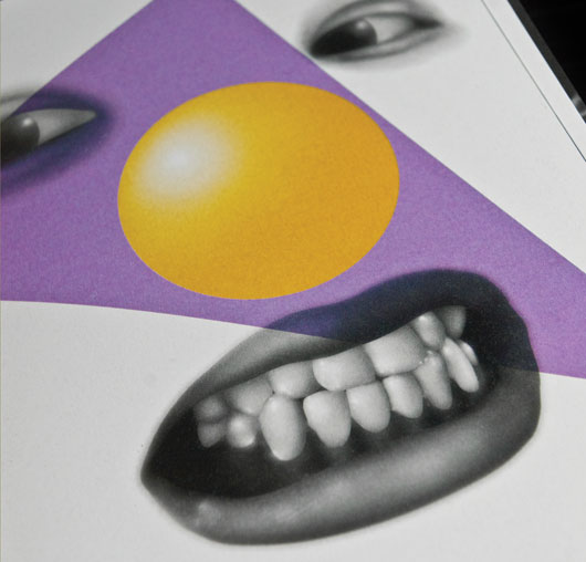
Said under-stimulation recently yielded PMKFA (Sixpack France; 25 €), his new book that features pieces ranging from abstract landscape photography to visual homages to his own musical passions, such as “screw, dancehall, and everything involving deep, synthetic bass.” The book includes distorted, hallucinatory character illustrations, shots of his pattern-based garments, and fully three-dimensional art installations—all of which, despite their material diversity, manage to feel like part of a coherent and consistent body of work. Cartoony gradient bombs on two feet stand next to hotdog counterparts, geometric light shows fill closed frames, and bizarre men on horseback are juxtaposed with old-timey jukeboxes. The designs are broken up by conversations between Thorsby and several of his friends and fellow artists, which provide elegant insight into the mind behind the designs. Oh, and purple seems to be the predominant color at work here, if you’re keeping score.
Clearly Thorsby isn’t short on creativity, but that doesn’t mean that he’s not constantly seeking ways to push himself. “When I compile my work, whether it be for books or websites, it’s always too see what I haven’t done—to extract what I did right but find out what I’m bad at, fill in those gaps, and work to feel more complete as a creator.”
?
PMKFA and an assortment of PMKFA-designed shirts are available here

