Michael Cina: The Ghostly designer and type wrangler talks about the cosmos, getting loose, and Led Zeppelin.
With clients as seemingly disparate as Hewlett-Packard, Pepsi, and Ghostly International, Minneapolis-based Michael Cina is […]
Michael Cina: The Ghostly designer and type wrangler talks about the cosmos, getting loose, and Led Zeppelin.
With clients as seemingly disparate as Hewlett-Packard, Pepsi, and Ghostly International, Minneapolis-based Michael Cina is […]

With clients as seemingly disparate as Hewlett-Packard, Pepsi, and Ghostly International, Minneapolis-based Michael Cina is a workhorse designer whose oeuvre is exemplary of an artist thinking in multiple media without elevating one over another.
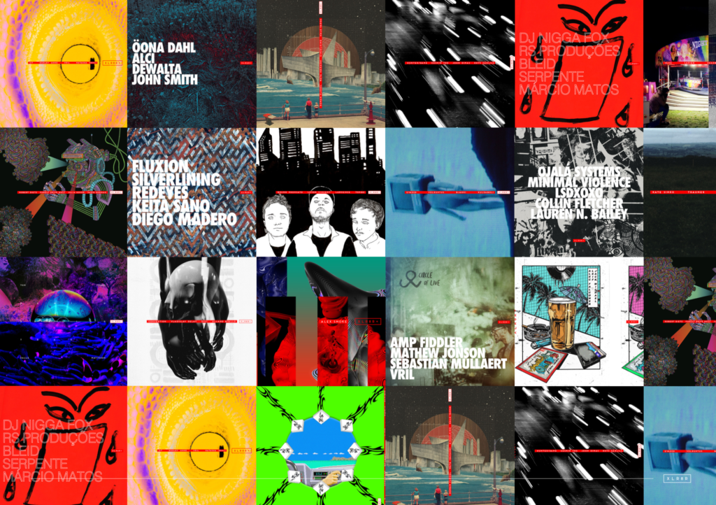
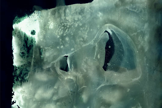
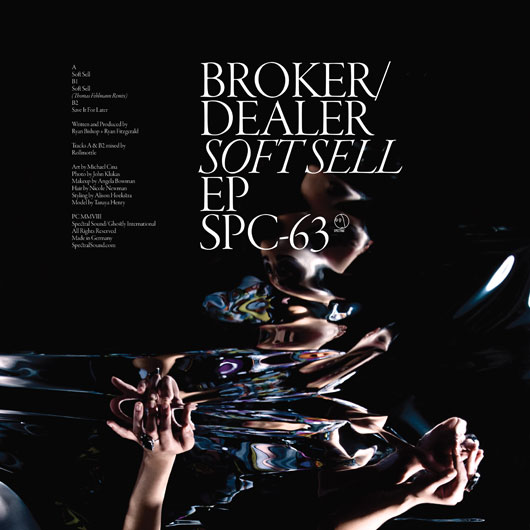
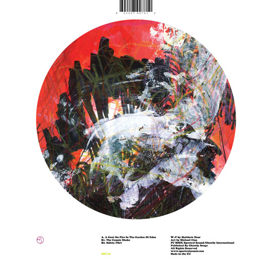
An inheritor of the idea of the gesamtkunstwerk (total artwork), Cina’s precise graphic design and typography for his YouWorkForThem design showcase is informed by his more abstract paintings, and vice-versa. “I don’t feel my career is based on a specific style like a lot of artists and designers,” Cina acknowledges, but this penchant for a more holistic view of what design and art can accomplish explains his many successes: collaborative design work has yielded contracts from Coca-Cola, Pepsi, and numerous other corporate giants, while his paintings have graced the covers of magazines and records for Kate Simko, Bodycode, and many more techno heavyweights. A former DJ and electronic music fan himself, Cina is meticulous about his record-cover design process, listening to the album repeatedly and “thinking about what it would look like, or how to represent it.” With a palette that’s equally informed by Twombly and Rothko, Cina’s covers complement the abstracted but obviously sensual music within, bringing some much-needed color to the often black-and-white world of techno sleeves. Here, he talks about his processes, organizational skills (or lack thereof), and most important influences.
?Did you study design? If so, what did you get from your education that wouldn’t necessarily translate to job skills?
Yes, I studied Graphic Communication and did horribly. I was DJing in Dallas at the time, but DJing more than doing school work. I slowly dropped out of college after five years and DJed for a year until reality woke me up. The most important things I learned were to work hard, be meticulous, and never be late. In school they would have you do 400 or more ideas for just a logo, the final had to be drawn exact (Rapidograph pens and Mylar), and there were no late projects.
??Do you find yourself coming back to certain themes throughout your work?
I have always been attracted to maps, diagrams, the cosmos, patterns, typography.
??What do you do when you are faced with a creative block?
Work harder (this is both good and bad). I should probably just read, but I seem to work until I get something going. Another good route is to just start over or just stop working on the project. There is nothing better than deleting a file that has troubled you.
Have you had a mentor-figure in your career who has influenced your work, work ethic, or process??
Emil Ruder was my main source into proper design. Before I dropped out of school, I picked up a paperback of Typographie for seven bucks and read it over and over and stared at the images. That book showed me ways to think and approach visual ideas that I was never taught. All my life I have wanted a real mentor, someone like Wolfgang Weingart or Wim Crouwel.
What typeface would you like to never see used again?
Papyrus.
??
What’s your process like? What’s the first thing you usually do?
Normally I will get a brief and just sit on it for a day, let it float around in my head. Sometimes I have an idea right away, and normally those don’t work out. Sometimes I sketch, sometimes I write down words. The main prerequisite for success is knowing what the client wants or knowing where it should go. That direction always leads me to good results.
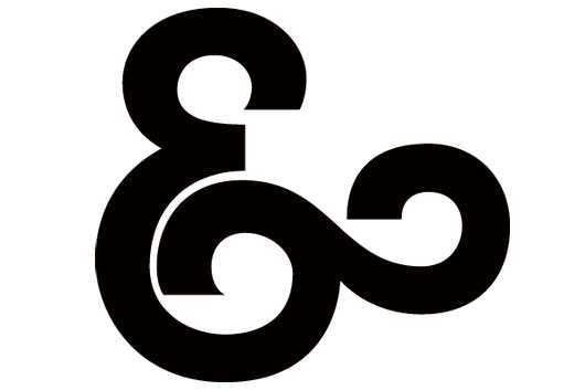
What do you find to be the biggest obstacle when designing type?
There are many. The first is ratio. I will draw five or so letters and realize that a curve is wrong or the metrics are bad. I redraw everything again, maybe five more times, until I get it right. If you don’t start over, your typeface will not turn out how it should and you resent it. This is something that took years to learn—you always fix mistakes. After that, it is either the lowercase or uppercase. If I start on lowercase letters, I don’t know how the upper will look, really, and that stumps me. There are different proportions and looks, too, so you have to get past that. Then, how many weights are you going to do, or any at all? Alternates or not? I always want alternates. Then you have to finish the full font. All 250 or more characters for a basic Latin set. That is the largest obstacle, as it is just a chore. Then exporting can be a royal pain as well. So the full process is an obstacle. Sometimes I really wonder why I do it until I see people use it well; that is probably the biggest payoff.
??
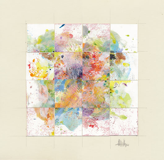
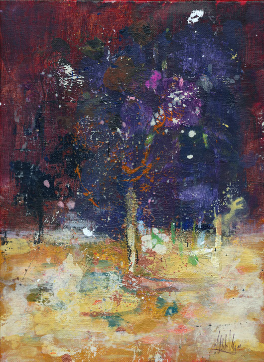
The two ends of the Michael Cina spectrum seem to be your abstract and gestural paintings, and the more rigid typography on the other. Do you feel one end is a reaction against the other?
?Totally. I struggle a lot without being “loose” enough in my design. It is easy for me to work with structure and grids. When you do art, you have to be loose, and the media fights against you. It’s a wonderful process because, unlike design, your work has to be perfect how it is. You can’t just tweak the colors in Photoshop or move something over a little. A painting is final. I learn a lot about typography/design through painting.
?What kind of music do you listen to while you work?
?Recently, it has been all modern classical, drone, ambient-kinda stuff. I really work well when I can concentrate. I really hate it when music distracts you and throws you off. Sometimes you don’t even know it’s the music. Right now, I am listening to Ethernet but the last two weeks I have been enjoying Loscil, Fjordne, Supersilent, Deathprod, Steven R Smith, aAirial, Ben Klock, The Sight Below, Kirby Leyland, and Mokira. Overall, I listen to everything—I am a music fanatic.
?
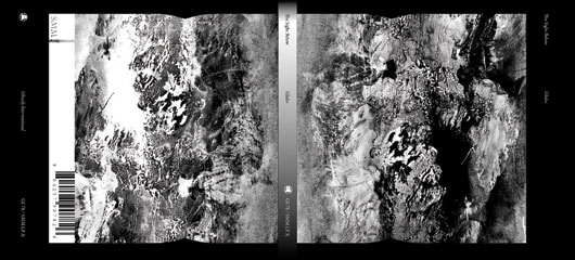
What ideas or directive, if any, did Ghostly give you when you started working with them?
[Label head] Sam Valenti is a visionary and I respect what he is doing 100%. When he asked me to do some work for Ghostly, Sam just said to do what you feel. He has stuck to his word this entire time and really is an advocate for design. As a designer, when someone says “do what you want,” it really means “do what you want, but after I see it I am going to give you a list of changes.” That has never happened. Overall, it is the most pure work I have done to date.
?
Which designers in the past seem to have had the biggest influence on your work?
?For design: Emil Ruder, Wolfgang Weingart, Wim Crouwel, Bauhaus School, Josef Muller-Brockmann, Karel Martens, Jacqueline Casey. For art: Rothko, Richter, Rauschenberg, Keiichi Tanaami, Cy Twombly, Warhol, Christopher Wool.
??
What are your five favorite album covers of all time, and why?
?Let me start by saying that ECM, Factory, Blue Note, and 4AD overall did no wrong. Lee Morgan’s The Rumproller is absolute classic typographic warping. Led Zeppelin’s Presence… Seeing this as a seven-year-old kid, it rocked my world. I spent hours of my life staring at this cover and thinking about what that object could be and why is it so important? I asked my parents what that object was and they didn’t know. Hipgnosis really were artists that happened to do album covers. Howlin Wolf’s This is Howlin’ Wolf’s new album. He doesn’t like it. He didn’t like his electric guitar at first either. It was pretty daring for Cadet to do a series of all text records; it fit in with the advertisements of the day. It also says he didn’t like the LP on the front cover. A true recipe for success! (Also see Muddy Waters’ Electric Mud and Section 25’s Section 25.) The 4AD compilation Lonely is an Eyesore, this album just rocked my world when I saw it. I didn’t even know what design was when I first bought it, but I knew this was perfection. Dave Liebman’s Drum Ode. If you forced me to pick one ECM cover, this would be it.
Where in nature do you find the most interesting shapes and forms?
All of nature contains patterns and math at the structure. There really isn’t much in nature that I don’t like looking at; that is one of the reasons I live in Minnesota. As an artist, all I am doing is ripping off what nature has already done 1000 times better.
??
What’s the best advice you’ve ever received?
I don’t even know what the best piece of advice would be. Most of what I learn in life is by making mistakes, not so much advice. My life is a path of mistakes. Listening to what other people say is hard for me to do.
interview by Tim Saputo

