Vis-Ed: Bok Bok
Slugs. The word could mean unsightly garden pests or lazy dudes, but in the case […]
Vis-Ed: Bok Bok
Slugs. The word could mean unsightly garden pests or lazy dudes, but in the case […]

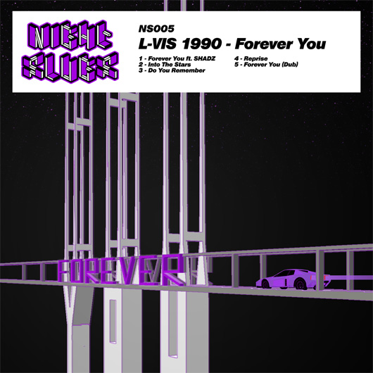
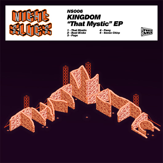
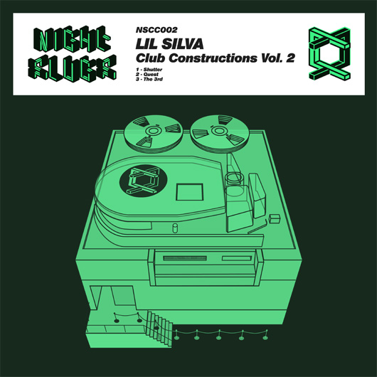
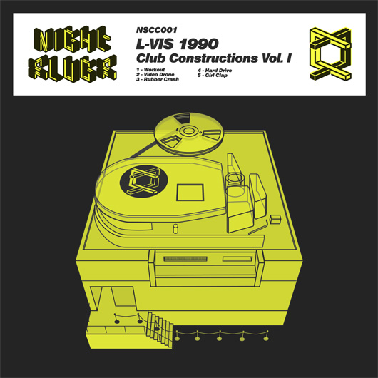
Slugs. The word could mean unsightly garden pests or lazy dudes, but in the case of London’s Night Slugs imprint, it clearly refers to bullets. Each release on the label is a deadly, precision-crafted thing, whether a swift, blunt grime rhythm or a crisp and carefully sculpted garage riff. A similarly detailed approach is given to Night Slugs’ artwork, under the direction of Bok Bok (a.k.a. Alex Sushon), a DJ/producer and the label’s owner alongside partner L-Vis 1990 (a.k.a. James Connolly). Since the dawn of the Night Slugs label in January 2010, Sushon has designed nearly everything the imprint has put out, from over 20 record sleeves to its iconic logo, a blueprint-like font composed of 3-D building blocks. Somehow, in between making music, hosting shows on Rinse FM, and traveling the globe to DJ, Bok Bok finds time to sit down with his favorite basic tools—a sketchpad and Adobe Illustrator—and knock out the magic. When he’s in London, this means long hours spent working at home in a rambling, three-story house in Camberwell, where he lives with three others (including Night Slugs artist Girl Unit) and a neighborhood cat that can open doors on its own and likes to play analog keyboards.
When we caught up with Bok Bok, he had just finished breakfast and was continuing work on a remix of Parris Mitchell’s “All Night Long,” a dirty Chicago house classic on Dance Mania, that’s being reissued by a Ukranian label. We talked at length about computer-generated environments, grime, simplicity, and the vibes of the virtual world.
XLR8R: What is a typical day when you are at home?
Bok Bok: I ?wake up around 11 a.m. at the earliest. Breakfast is usually either eggs and chorizo or a banh mi sandwich. This part is important! Then I get down to work for the rest of the day: emails and taking care of business get done as quickly as possible and then I get down to some music by mid-to-late afternoon and into the night.
Did you start doing graphics before music?
I was doing graphics first. It’s definitely something I was staying late after school learning to do for fun. A lot of people at that time were trying to make garage in the music lab on Fruity Loops. I dunno why that wasn’t me, but there you go. I did go to art school but they don’t teach you how to make work there… at least not the one I went to. It’s all “theory,” apparently (but that’s a conversation for another day). You basically get four years to teach yourself as much as possible. I definitely learnt a lot about cohesion, continuity, and how to communicate with an audience in general, though.
Growing up, did have any visual influences that stand out to you now?
In music (as well as any other design), I have always loved series. I find them so satisfying: modularity, repetition, having a template. The Penguin Books are an obvious example. I have so many in the house. I’m referring to this kind of series, with the redesign and new modernist template they brought in.
When you started off with Night Slugs, did you have a particular palette or a general aesthetic in mind?
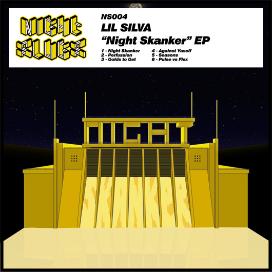
Yeah, absolutely. I kept thinking about the Panasonic Glider commercial and the original Tron, too. They’re both such beautiful examples of what you can create with a really limited palette—and even though they’re trying to describe digital environments, they’re both so warm. I’m generally just really interested in early computer art of this kind, depicting a world of wireframes and light-structures.
That’s interesting, given your love of grime music. It seems like another example of something that is simple and often made with limited equipment but really powerful.
Exactly, it’s the same thing to me… It’s about how to be really wild and expressive with very few elements.
To what extent do you fetishize the 1980s?
[laughs] That’s a great question, because I guess it can be leveled at our team as a whole! I mean, we’re children of the ’80s; for me, the mid ’80s. But I’d like to think it’s more than just fetishization or tapping into an aesthetic. It was an important time because of where technology and pop culture came to a head, you know? In a lot of ways, it’s the last time a lot of things felt truly new and glowed with vibrance.
I’m asking about the ’80s because some of the recent Night Slugs releases, Girl Unit and the Jam City in particular, seem to reflect an interest in an ’80s electro-funk or freestyle sound refracted through a modern prism.
Yeah, there’s definitely a lot of that going on lately. We’re all close in age, so I guess that syndrome sort of runs across the whole camp, but I always like to circumvent thinking about time in a normal way. I always joke that in Night Slugs time doesn’t exist, so we can just pluck whatever we want from wherever. I don’t think about being futuristic any more than I think about being retro. It’s all more abstract to me; it’s all arranging structures and shapes until they’re in a really bold formation.
I also wanted to talk about virtual reality in relation to Night Slugs. Girl Unit was once telling me how you guys used to be into Second Life. What interests you about those kind of virtual environments?
Second Life is kinda dying, but it’s really interesting for so many reasons, not all of them good. On a really basic level, I like just cruising around and getting vibes from the scenery. People make, like, their own islands and stuff. I think of it as tourism. Kinda like this [Minecraft recreation of Frank Lloyd Wright’s Ennis House]. I’m into a lot of 3-D representation in general; it just makes me laugh a lot of the time, which is a big part of the appeal. At Christmas time, we tend to get mad high and just fly airplanes on San Andreas into sunsets and stuff. In terms of Night Slugs, the artwork has always definitely always been a place for the music to inhabit. It sort of works to put all the releases together in their own world or worlds.
Do other Night Slugs artists think of their music as being made for virtual environments?
It’s interesting because yeah, a lot of the time we do talk about an idea of the location or situation [the music is set in]. It might not be in [the artist’s] head when they’re writing, or maybe it is…
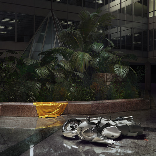
I know you didn’t do the cover of the Jam City Classical Curves album but I think it ties in so well to this idea.
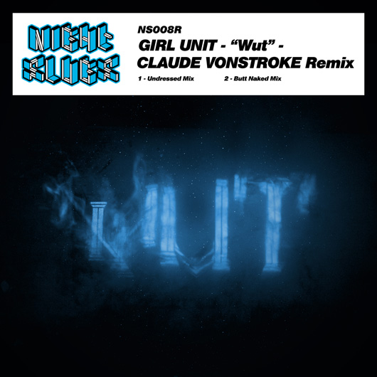
I’m glad you think that. The whole art direction of the label is definitely in a new phase. It’s slightly different the way we did the Jam City cover, but I still think it ties in to the aesthetic just as much. It’s the same thing [we ‘ve been doing, but] with a lot more definition because that’s what his vision dictated. He was more focused on a very specific situation for a lot of reasons, some of which he goes into in this interview with Dummy Mag. The cover was done by a genius team called Bowyer, and then Ms. Muzik Channel made the videos. It was an involved project for sure.
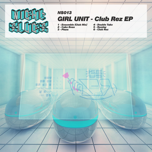
For [Girl Unit’s] Club Rez, the rendering was done by Sina Taherkhani, an NYC-based multimedia designer. He does a lot of really cool stuff in 3-D, so we’d give him a really specific spec of exactly what we wanted and he would bring it to life. The music is becoming more high-res, so I feel the art should follow. This will mean more collaborations for sure. I might not be the one drawing the covers, but it will still be me putting together the concept or [me] in collaboration with the artist. The ones where the artist has a really strong input are always the best.
How much input do the artists have on their covers?
Jam had an incredibly vivid idea of what he wanted; the ideas that went into the music were so visual, so he had a big hand in his own art direction. Girl Unit was really key to the Club Rez art too, but in the past he has given me a keyword or theme to pursue. L-Vis and Kingdom both always have strong ideas visually as well. Many of us are from a visual-art background, so it makes sense.
Does an artist literally say, “I see a pyramid” or “I want a Mayan temple”?
[Girl Unit] might say, “I want something Catholic,” or [Jam City] might say, “Make it set in a grimy red brick,” and then I’ll interpret that in a way that looks like a level in a point-and-click, but I’ll try and make it really fucking spooky, considering it’s just basic pixel shapes. Sometimes those locations in game worlds can have such a vibe, they can give you tingles.
One that really intrigued me was the cover of Kingdom’s Dreama EP. What’s going on there?
It’s like an abandoned terrace club in the forest… or not abandoned, but inexplicably empty.
We’ve talked a lot about virtual environments, but do you see any connection between your actual environment in London and the kind of visuals you make?
Yeah, but then again I see a connection to a lot of other cities I’ve been to as well. Definitely London to some extent—like, the structure on the cover of my Southside EP is supposed to be this hyperstructure that encloses the city with forest surrounding it (and then the forest is flooded on the remix package). In my mind, that’s in South London. That EP is really heavily grime influenced, so it’s inevitable that it would be set in a London of some sort.
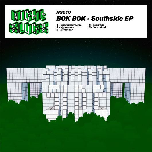
Funny enough, because I’m American and because of the title of the EP…
It seems like Chicago?
Yeah! And why does it have a forest?
Right. I mean, a lot of cities have a Southside. Also, I can’t say that ambiguity [about what city it is] isn’t intentional. Why the forest? I don’t know… I guess because it’s an alternate time when the city is inside a gigantic Superstudio metabuilding shut off from the outside world, kind of like this.
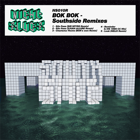
Sorry if I’m asking you to get too specific. I don’t want you to give up all the mystery but I think it’s so interesting.
I’m happy to talk about it! Anyway, these ideas are more in my head and that’s not necessarily what needs to be communicated to the audience. The main thing is I’m hoping the tracks and the artwork augment each other, creating something further, a little mythology.
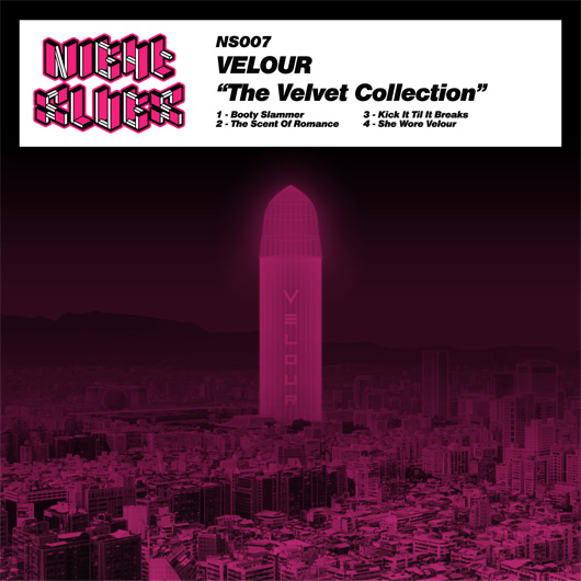
So I guess we don’t need to talk about the glowing phallus on the Velour cover then.
[laughs] That one is pretty unambiguous! Pervy, more like. It’s trouser tent music.
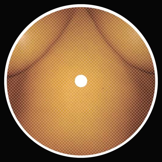
Speaking of pervy, I was kind of surprised at the boobs on the cover of the Cubic Zirconia remix. Definitely the most sexual thing I’ve seen on Night Slugs.
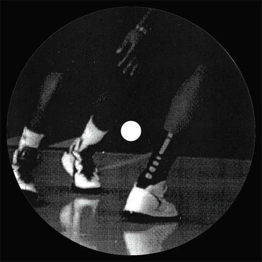
Well, the white label series is a law unto itself. That particular one links in to Cubic Zirconia’s single, for which this was a bootleg remix-type package. They weren’t just random boobs! And it’s kind of a booty-oriented record, so I guess it fits. The white-label series is fun now because I can put art on there if I want or leave it blank. Lately, I’ve been having fun putting whatever photocopies are lying around on there, just whatever’s on my desk or in the house. It will usually link in, like photos of Flirta for Helix’s 12″ or basketball shoes for “The Courts.” There’s so much work that goes into the main series that it’s nice to be able to slap whatever onto the white labels.
Do you have any rituals or anything you do when you’re not feeling inspired?
I definitely spend a bit of time thinking about an idea passively and one usually emerges. I’m lucky in this way—back when I had a day job in design, you had to think of ideas on the spot constantly. I just take my time thinking about stuff and a bike ride usually really helps; think about what you want to come up with before you start, then ride. Repetitive exercise is really good for ideas. I also take little snaps when I travel, usually in city centers or airports, of cool or terrifying structures.
I have to know what you find a terrifying structure.
Like this. It’s horrifying. This is what my nightmares are like: 4-D shit.
?What are some other labels (new or classic) whose aesthetic you really admire?
People have asked me this before, and I was stumped. I currently like how Sound Pellegrino has done it—it’s obviously riffing on a style but the typography in particular is beautiful. But overall, I guess record-sleeve design isn’t somewhere I take inspiration from that much. I mean, most of my favorite records look like shit; they have handwritten one-word titles in marker pen or inkjet-printed tracklists in color or they’re white labels that are a bit blue for some reason. But I love how Dance Mania and Trax had that same template pretty much for everything (with slight variations) for, like, 10 years each or thereabouts. That aspect is a big influence, for sure. It’s just so satisfying to stack up their catalog. I want our releases to feel like that.
?What are your graphic design pet peeves/worst clichés?
I ?eternally hate the “bad on purpose”-type stuff that is so easy to make. But worst of all is the “vintage filter” Instagram aesthetic! Why are people documenting current events via this filter? Is time over? Are we stuck in a constant nostalgia loop?

