Interview: Native Instruments’ Scott Hobbs on iMaschine 2
Native Instruments’ ubiquitous sampler/drum-machine powerhouse gets a complete overhaul for its iOS reboot.

Since its initial release in 2009, the Maschine hardware has found its home in many a music production studio, thanks largely to its clean, intuitive interface, excellent pads and deep sound library. Just launched on the iOS App Store, iMaschine 2 effectively translates this experience to a touchscreen format, and is Native Instruments’ most powerful iOS release to date.
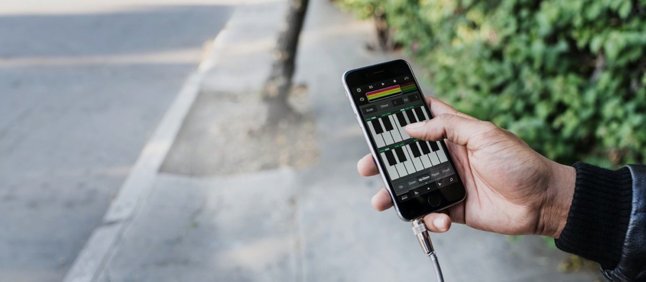
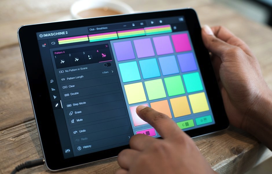
iMaschine 2 brings with it a surprisingly impressive lineup of features found on desktop, including a brand new Step Mode, with step-sequencing of each pad; a new Arranger for putting together proper track arrangements; and scale, chord, and arpeggiator functionality, all which are incredibly fun to play on a touchscreen. There’s even 3D Touch controls, provided you’ve got a new iPhone: Select “3D” in the Note Repeat function, and the rate changes depending on how hard you press your finger against the screen. To boot, you can grab the set you’re working out on your phone, chuck it into Maschine in your studio, and be ready to go in a matter of minutes.
We spoke with the driving design force behind iMaschine 2, Native Instruments senior product designer Scott Hobbs, about his team’s work on the app.
Maschine has become a studio staple, largely due to its crisp workflow and controls. Was this the core of what you were trying to preserve with iMaschine 2?
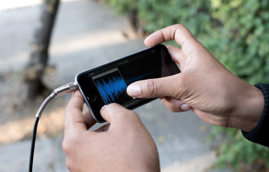
Absolutely. These qualities are central to the Maschine hardware concept, and are also essential for iMaschine 2. What’s specific to iMaschine 2, however, are the different environments and contexts producers will use it in, and we had to design with this in mind. When a producer wants to record a sample on the move, for instance, or quickly capture a track idea, iMaschine 2 needs to allow the user to achieve that with as little friction as possible. While we aimed to deliver much deeper functionality with iMaschine 2, adding complexity to the interface and workflow was not an option—that was the challenge.
“We wanted to empower users with the ability to make more than quick loops—to allow them to create full tracks no matter where they are.”
How did you approach the project? Was this considered a more-or-less complete reboot of the original iMaschine?
Reboot is a great phrase. iMaschine 1 was a successful app, and served well as a sketchpad, but we knew we could take it further. Since the original release in 2011, mobile devices have become more integrated with our lives, and are fast becoming go-to tools for producers. We wanted to empower users with the ability to make more than quick loops—to allow them to create full tracks no matter where they are. Over the years, we’ve had a lot of feedback in terms of how people were using the product, and how people wanted to use it. We were listening.
What was the trickiest thing about bringing the essential Maschine experience to iOS?
The most complex design work is distilling deep features into something lightweight and quick to use, but still powerful. Take Step Mode, for example: it’s relatively simple in comparison to Maschine, but it offers the same core functionality. Every feature option that was excused was done so with careful consideration, and comprehensive usability study. We prototyped several different designs with varying degrees of complexity, and tested these out with users. We continued to refine the concept until the interface was easy to learn, and allowed the users to capture their musical ideas efficiently.

What’s a small detail in iMaschine 2 you’re particularly proud of?
Well, it’s not a small detail by any means, but I’m proud of our 3D Touch integration. iPhone 6S users can take advantage of the pad shortcuts, and skip menus almost entirely when making beats. This really helps producers stay focused on the music. We also implemented pressure-sensitive note repeat—this is functionality and an interaction that was previously only possible with hardware interfaces. 3D Note Repeat has 2 modes: A fixed rate mode (1/8, 1/16, etc), where the pressure on the pad controls velocity, and a second where the velocity is fixed, and the rate is variable, via pressure on the pad. 3D Touch really pushes iMaschine to a new level.
In your estimation, what are the aspects of the touch interface that have been holding it back from becoming a primary platform for music production, and perhaps even replacing the standard desktop workflows? Technologies like 3D Touch feel like steps in the right direction….
Touchscreens are fantastic interfaces—they’ve opened up new paradigms in how we interact with software. They fuse traditional software and hardware interfaces with incredible versatility. That said, for music tools, they lack tactility and haptic feedback. Many producers inherently want to have physical control over the tools they’re using—clicking a button, moving a physical fader, feeling the feedback from a set of keys.
3D Touch is definitely a step towards fulfilling this need, and an exciting innovation. I believe that touch devices will continue to deliver more advantages over traditional interfaces—and for some users in the future, these will outweigh the benefits of having a desktop computer and multiple pieces of hardware. As touch technology evolves, as screens become larger and devices more powerful, software interfaces will cater to more demanding needs, and touch-based computing will undoubtedly become more central in creators toolkits. It’s just a matter of time.

What are some of your favorite hidden features in iMaschine 2?
They wouldn’t be features if they were hidden! We really wanted to make every aspect of iMaschine 2 as discoverable, intuitive and useful as possible, so there really shouldn’t be anything hidden from you. What is currently hidden behind NI doors, however, are some of my favorite features.

