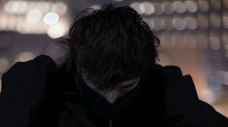
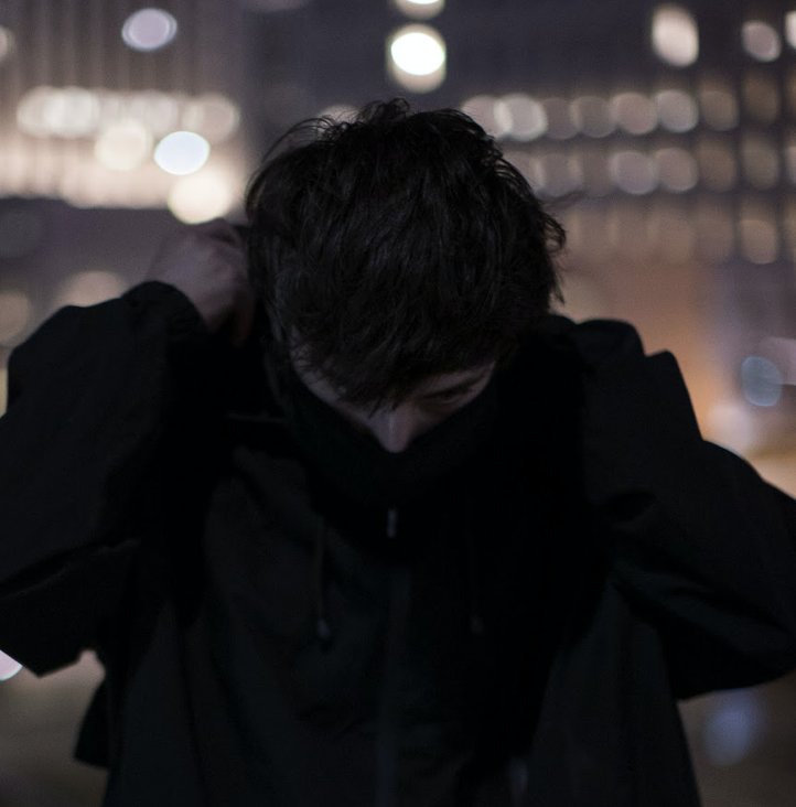
Príncipe has released a new EP from PML Beatz, a collaboration of two brothers, Lisandro, 20, and Ivan, 22.
Of Cape Verdean and Angolan descent, Lisandro, 20, and Ivan, 22, are no longer producing physically as a team but they currently exchange ideas from their respective homes in Portugal and Luxembourg, one of the countries where Portuguese have traditionally sought a better life.
The duo developed an interest in making music in 2010 but they were still too young to play with software, and then they returned to it in 2017 when they approached neighbour DJ Bebedera for serious lessons. They had been listening to him blasting fresh sounds each weekend.
Pedra de 800 kg is the duo’s first release on Príncipe, and follows a series of self-releases via Soundcloud. The title is an adaptation of a motivational expression their father used when the kids were having trouble with something: “That’s easier than lifting a 500 kg rock,” he used to say.
We’re told that the title track “delivers a magnificent, warped, kuduro punch, updating the continuum with an abstract, fast, elastic, dancefloor-designed tune.” You can sense a heaviness in the distorted bass tones and everlasting drone on “Manganza,” while “No Cubau,” the opener, is “a journey through layers of groove that, though tense, gently carry the listener from take off to landing with zero alienation,” the label adds.
This is Príncipe’s first release of 2020.
Tracklisting
A1. No Cubau B1. Manganza B2. Pedra de 800 kg
Pedra de 800 kg is available now via Bandcamp. Copies are limited to just 300, with hand-painted sleeves by Márcio Matos. Meanwhile, you can stream “No Cubau” below.
London label Entity will release a new various artist compilation featuring tracks from Enrico Mantini, Christian Jay, Harry Wills, and more.
Entity formed in 2017 but a year has passed since its last release, the Alec Falconer-helmed Entity 005. In that time, the emerging label has taken the time to compose a record built on different styles that sit within the label’s signature sound, incorporating minimal, deep house, breaks, and 2-step flavours over eight tracks.
Entity VA 002 is described as “a meeting of the minds between legends of the scene and up and coming talent.” Alongside ’90s names like Enrico Mantini and Dem2 are several rising producers, such as Ease Up George, Harry Wills, Perception, Ingi Visions, Christian Jay, and Zero FG. There’s also a bonus track by enchanted rhythms-affiliated artist DJ Gear Hoover titled “Studio Gear.”
Tracklisting:
A1. Enrico Mantini “Fakers” A2. Ease Up George “Badbwoy” B1. Dem 2 “Klang” B2. Perception “Limitless” C1. Christian Jay “HB” C2. Harry Wills “Slink” D1. Ingi Visions “Throwback” D2. Zero FG “Knock Knock” D3. Bonus Track | DJ Gear Hoover “Studio Gear”
Entity VA 002 will be released at the end of January on vinyl. You can find snippets of the release below, and it’s available to pre-order order here now.
Little Snake has shared “I. OYU3.33REA,” the lead single from YATDC, his new Brainfeeder EP.
YATDC is Little Snake’s third EP on the Los Angeles label, following 2019’s Lost In Spirals. It comprises four new productions that “juxtapose space, texture, melody, tempo, and rhythm,” the label explains.
“YATDC does not fit into the category of an EP, an LP, or anything in between,” Little Snake explains. “YATDC is a message, delivered to you by omnipresent entities that have appeared in your skies for some time, via Little Snake as a vessel. It is something you have known for a long time, and you will soon return to it. Although you could not be told this directly, and even when you have deciphered it in full, words cannot fathom it. Through the centre point of every force and motion within this message, you will find the truth…”
Little Snake, real name Gino Serpentini, resides in Calgary, Alberta. His tracks have become a staple in the sets of Flying Lotus, who signed him to Brainfeeder in 2018, describing his productions as “fkn insane.” You can read more about Little Snake in our extended interview here.
Earlier this month, Brainfeeder unveiled a new album from Thundercat.
Tracklisting
01. I. OYU3.33REA 02. II. ETH2.22 03. III. 4.62287ARMED 04. IV. REACTOR0.93713
FACT Magazine will resurrect its print edition this year.
FACT launched in the UK in 2003 as a bi-monthly print magazine, before going digital in 2008, spearheaded by founding editor Sean Bidder.
The new-look edition marks the end of the online features, news, and reviews; instead, the site will focus on photography, audio, and video, including documentaries and the popular Against the Clock series. The mix series will also remain.
The new print magazine aims to “celebrate the written word and original photography,” commissioned from a global community of writers, image-makers, and artists to create “strikingly realized long-form content,” the announcement explains. It will be distributed globally and focus on the intersection between electronic music and audio-visual art, “championing both established pioneers and new talent from around the world.”
FACT will also present a series of immersive exhibitions at 180 The Strand in London, including a show by Japanese artist Ryoji Ikeda, which starts in October.
Luke Slater, Steve Bicknell, and David Sumner (a.k.a Function) will release a new EP as LSD, titled Third Process, out February 17.
Third Process forms the third installment of the trio’s Process series, and follows two double packs on Ostgut Ton and the first release on their self-titled LSD imprint last year.
We’re told to expect “a fierce three-track techno pack,” with futuristic drum programming and mind-melting melodies “for maximum dancefloor impact.”
LSD focuses on the psychedelic aspects of techno while emphasizing the cross-pollination of each member’s style and rhythmic sensibility. The project’s seeds were planted during a mutual gig at the Moulin Rouge, Paris in July 2015 in support of Function’s Berghain 07 mix. There, the trio exchanged thoughts on a collaboration that would blur the line between DJing and live performance, with each member manipulating separate elements and tracks to unpredictably construct and deconstruct the whole.
Tracklisting
A. Process 10 B1. Process 11 B2. Process 12
Third Process is out February 17 on 12″ and digital. Meanwhile, you can stream clips below and pre-order here.
Today is our latest edition of The Factory, a series that explores music’s relationship with other art forms and how it permeates into the aesthetic of the visual artists, designers, studios, and event producers that operate behind the scenes in the music industry. The last time The Factory appeared on XLR8R’s pages was in August, featuring visual artist João Salgueiro (a.k.a Tombo). After Lauren N. Bailey and Collin Fletcher recently featured as our visual artists on XLR8R+, we thought it was time to continue our exploration of the work of the talented artists behind some of our most loved labels, events, and music. You can find out more about XLR8R+, our movement to support independent music and journalism, and how you can help support independent culture HERE.
Collin Fletcher’s profile across music has been on a steep upward trajectory over recent years, fuelled by his textured record sleeves, cassette tapes, and band T-shirts. His work, influenced by punk and DIY aesthetics, is characterized by its moody and atmospheric aesthetic, created with a mix of black, burgundy, and navy with odd flashes of white and pink. “I think that when things are black and white you’re paying more attention to the form and the images rather than the colour making you feel some kind of way,” he says.
Originally from Tempe, Arizona, Fletcher began his career as a design student, and found his way into music by being a promoter. Work with labels Ascetic House and Halcyon Veil led to art and design commissions for other electronic artists and labels like Tri Angle, Ghostly, Kranky, and Warp, and inspired a move to the West Coast to focus on creative direction for Yves Tumor among other more mainstream acts such as Post Malone, Zedd, and Halsey. He’s primarily working on physical releases—LP/CD/tape—but he also focuses on live promotion and production, merchandise design, fashion, and occasionally video.
Bailey, by contrast, works primarily with posters and flyers and specifically on type and type layouts. She likes to incorporate different manual processes and apply real, physical qualities to her work, even when the work may only function digitally. These processes include screen printing, linoleum block printing, rubber stamps, manipulating fabric, as well as playing with printer halftones and paper textures.
Nowadays, Bailey and Fletcher collaborate on projects, including HOCO Festival and our recent XLR8R+ design, a collage of their work that represents their physical, punk influences even though it was done completely digitally. “From a process standpoint, it represents exactly where we’re at right now in our own practices,” they explain. We caught up with them one day to learn more about their work.
How did you begin working together?
We were in the same class in the Arizona State University Graphic Design program, so it was most likely helping each other with projects. Having the same educational experience has definitely led us to seek each other’s input, even on our individual projects.
How does it work when it comes to a collaborative design?
It usually works like the exercise you’d do in elementary school writing class where one person writes a paragraph in a story, then passes it on to the next person to add their own paragraph until you have an end result neither person could have come up with on their own. It often starts with a photoshop file, saving it, and then passing it back to the other person. On other occasions, it’s simply asking for feedback while in the middle of working on something.
How do you feel the end result differs to your solo work?
Working together might be kind of comparable to having an editor as a writer. We let each other know what’s working and not cutting it in our designs; we offer each other new things to consider and tell each other what areas might need more work. Maybe the end result doesn’t differ from solo work but it’s supported and more considered.
“..I focus more on trying to find the best way to visually communicate the information. If someone decided not to read all the text on a flyer, hopefully the design would still communicate a general vibe or idea.”
— Lauren N. Bailey
How do you each map out and decide which processes—digital, physical, printing—to use?
CF: The production requirements are a big determining factor for which processes I use. For example, if a show poster needs to be implemented into a ton of different social media banner sizes and admats, etc., it’s much easier to use a digital texture and have the ability to work with an editable file that appears printed so I’m not reprinting and scanning constantly. However, working physically does look best, so album covers or graphics worth emphasizing the small details on will usually have some physical step, whether it be printing and scanning the whole graphic or tracing, handwriting, painting, etc. Nowadays, most of my work is a combination of both physical components and digital-specific methods, which I think is the most contemporary process. Computer software has incredibly powerful tools that didn’t even exist five years ago. I try to remind myself that staying current with technology is as important to timelessness in design.
LB: I try to use whatever medium makes the most sense, but sometimes I decide solely based on what I am curious about or wanting to play with at that time. The flyer for the 2017 Boy Harsher show in Phoenix was screen-printed on a mesh-y beige fabric because I was influenced by photos I had seen of band-members Jae and Gus draped in a similar material. On the other hand, most of the linocut projects were done as linocuts because I was trying to teach myself to work in a different medium. Another determining factor would be time, of course; if a project has a tight deadline, hand carving a linoleum block might not be the most practical!
2017 Boy Harsher flyer, by Lauren N. BaileyDrab Majesty flyer, by Lauren N. Bailey
How do you find the balance between staying true to your style and continually innovating?
LB: I’m not too concerned with sticking to a specific style; I focus more on trying to find the best way to visually communicate the information. If someone decided not to read all the text on a flyer, hopefully the design would still communicate a general vibe or idea. I think that’s more important than making stylistic decisions that say “Lauren made this” or something. Even saying and practicing that, the “style” usually comes out organically.
CF: Yes, I think there’s a natural tendency to execute your own “style” regardless. It’s like the way you walk or how your voice sounds; what’s recognizable about you isn’t conscious to yourself. I’ve formed habits in my technique and established go-tos for typefaces, colors, and textures. I think the collaborative element of working with new clients while maintaining these habits and go-tos provides that balance between personal integrity and innovation.
It feels like you’ve both found your voice in a saturated world. What’s the secret?
LB: Stay curious about things outside of graphic design. I’m mostly inspired by everything outside of a more direct design culture. I think that is what keeps things fresh and interesting. Keep making, too; when there is a lull in client work, make personal projects. I also think it’s good to take breaks from client work. For me, personal projects help reconnect with the voice you are referring to.
CF: One hundred percent agree with Lauren. Don’t perceive yourself as a part of a scene or specific industry. If you’re a graphic designer, approach your practice like an artist or musician. If you’re an artist, approach it like a designer. Recognize your peers and learn from them; don’t think of others in your field as competition. Don’t “break into” a scene; do your own thing until like-minded people find you!
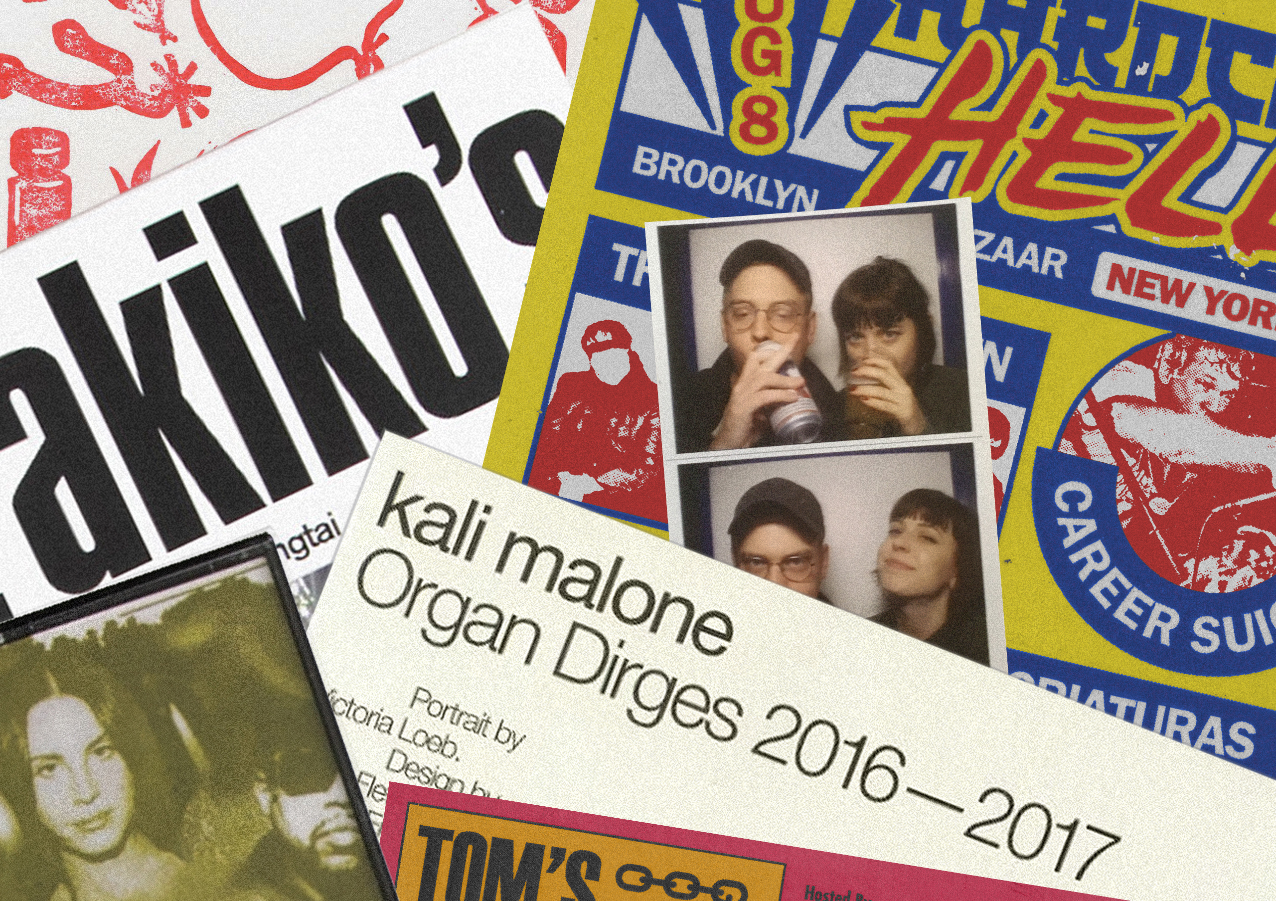
Collin Fletcher and Lauren N. Bailey
What’s the process when doing work for clients in music? Are you generally given briefs or guidelines to work to?
CF: In terms of working on a release, the artist usually comes to me with an idea or a general mood they’re hoping to convey and I’ll work with them through every revision until we’re at a result that we’re both happy with. The larger artists are actually much more unpredictable. Sometimes the major label’s direction and feedback is whom you’re answering to because it’s a marketing thing. Other times the artist will accept and love the first idea sent over because the graphic side is far less important than their appearance in a photoshoot, for instance.
LB: Every client is different. Some people have a specific idea in mind, and just need someone who knows how to make it happen. Other people may have ideas about their art direction but want a lot of the designer’s input and ideas. I’d say in all cases, I start with doing research. I’m a moodboarder and I am not ashamed to say I pull references before I get started. The design process usually involves initial directions that are slimmed down to a single direction. Following is a lot of back and forth, going through variations of that direction and small to large changes of the design until we can both settle on something we mutually like. I am usually in my computer in Illustrator before moving onto any other process like screenprinting and linoleum blocks.
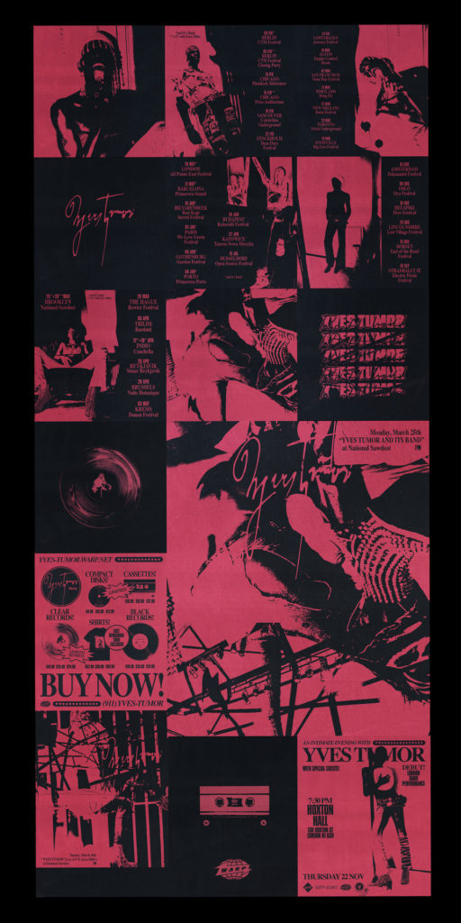
“Yves Tumor calls all the shots but ultimately gives Creative Director Isamaya Ffrench and I the freedom to craft this character into our most fucked version of a pop star we can imagine.”
—Collin Fletcher
How do you find the balance between satisfying the client and your own creative instincts?
LB: It can definitely be difficult. I don’t really agree with the customer is always right mindset. If you are hired for your expertise, then your opinion and decisions should be understood. Client feedback is very important though! Sometimes you have been staring at a design for 10 hours, and you send it off not knowing what it is missing. A client sees it with fresh eyes and knows exactly the thing to do to make it better. Client work can be collaborative and often the results are significantly improved with the extra eyes.
CF: I haven’t found that balance and probably never will. Every client is different and on most occasions it’s more than one person’s opinion that you’re catering to. I try to accompany every draft or idea with written reasoning, especially if there’s an obvious, generic alternative that you anticipate the client is looking for. Addressing that before they have a chance to respond with “what if you tried this…” reinforces your decisions. Also, it’s important to pick your battles. Evaluating which decisions are more important than others prevents a dynamic where you’re butting heads with the client every step of the way.
Yves Tumor ‘Safe in the Hands of Love’ album cover, by Collin Fletcher
Collin, can you talk about your work and art direction for Yves Tumor—how did that come about, and how does the working relationship work?
We met a few years ago when he played a warehouse show in Phoenix that I booked with Rabit. He was DJing under a different name at the time and the Yves Tumor PAN record came out a few months after. We’d stayed in touch somewhat since then and he asked me to help with the packaging design for Safe in the Hands of Love last year after the photoshoot had already taken place. I sort of took on more “creative direction” reigns from that point on as we fleshed out the tour graphics, merchandise, social media presence, and everything that exists after the album came out. We’ve been working on a lot of things coming soon that I’m really excited about. Sean (Bowie a.k.a Yves Tumor) calls all the shots but ultimately gives Creative Director Isamaya Ffrench and I the freedom to craft this character into our most fucked version of a pop star we can imagine. Isamaya has a background in beauty and fashion while mine is everything but that, so it’s a collaboration that I think treads a fine line between accessible yet progressive.
What sort of message are you trying to communicate with the Yves Tumor artwork?
It’s a complicated question for Yves Tumor specifically. The brief for that project as a whole artist is constant redefinition. Musically, aesthetically, and even thematically. The internet has a tendency to define musician’s careers and place them into like-categories, whether it be genre or the message, and expect them to cater to that mold. The experimental people see his Ryiuchi Sakamoto association or early PAN stuff and want to witness the next generation of progressive electronic music. Fans who see music as a political tool want to see Yves Tumor become an icon for black, queer, socially-charged art. These boxes all have their aesthetic cues and the goal is to address all of them and yet none of them. If someone sees the Safe in the Hands of Love art and expects a certain genre, I’d hope they’re surprised to hear something wildly opposite to their expectations and hear the music as it is. If a new fan is gained from that interaction with the art, then I’d say the intended message has been received.
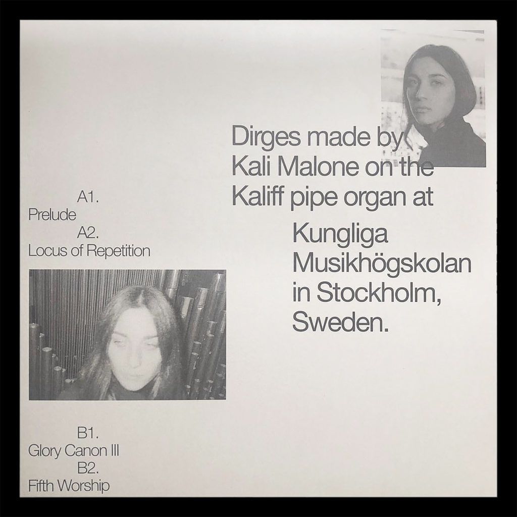
Yves Tumor flyer, by Collin FletcherKali Malone 12″ cover, by Collin Fletcher
Collin, What are the other projects that have really excited you as an artist?
I designed Kali Malone’s Organ Dirges tape on Ascetic House. It was a part of a 12-tape batch, but that record translated to me visually in such a specific way that I felt really satisfied with the outcome of that design. Since then, we did a 12” vinyl version that I think further emphasized the correlation between the typography and layout, and the minimal musical compositions Kali wrote for the record. It’s been really exciting to see how well received that release has been internationally, and extremely satisfying to see Kali bringing her music to more audiences.
And how do you approach work for artists or clients that may not fit your personal aesthetic and style (Zedd, Halsey, etc.)?
In those instances, I tend to be more of a technical production guy rather than a creative influence. My background in typography and layout can be applied to any type of artist or industry. For Zedd, as an example, I work under a creative director, Imogene Strauss, whose ideas are being interpreted and executed through my design abilities. She’ll then work closely with a photographer and/or 3D artists in a similar manner for other aspects of Zedd’s overall identity.
Those bigger budget artists are more about assembling teams with specific abilities rather than relying fully on myself to create every visual element of an artist, like I would with the smaller underground artists. On the other hand, Post Malone is a really exciting artist where the super progressive ideas Travis and Bryan—Post Malone’s art directors and graphic designers—have been pushing through the label have become canon to Post’s identity, and there’s essentially no one telling us the abstract experimentation is wrong. Honestly, I invest a lot of energy into working with Travis and Bryan because it’s one of the only mainstreams artists that is capable of introducing a genuinely experimental visual language to a large audience that is not normally challenged in that way.
What artists and/or designers inspire you both, and why?
CF: John Wiese has always been a major aesthetic and ideological influence to me. His work musically and visually has always maintained this extremely careful balance of understanding its place in culture while innovating within it. His marriage of timeless graphic design principles to the aesthetic opposite extremes of punk processes is hugely impactful to me in terms of design. And the way his solo music, his grindcore band, his fine art, books, and video all tread such contrasting concepts yet all feel uniquely John Wiese is exactly how I would hope others perceive my body of work.
LF: I’ve been following Kevin McCaughey (a.k.a NonPorous/Boot Boyz Biz) for years, and I am deeply influenced by his work. His knowledge of typography and ability to be maximal while also having intelligent layouts and balance is something I have major respect for. His ability to talk about history and topics related to art, music, and design through clothing and small publications is so cool to me.
I’ve also just generally been excited about design that has come out of the Arizona music scene. Arizona H.I.P. Flyers is an archive of hardcore, indie, and punk show flyers that goes back as far as the ‘70s. Collin, Js. Aurelius, and Chase Mason are the AZ real ones as far as it goes with design. Private Selection is Los Angeles-based and always has really sick heavily textured and futuristic designs. I look at a lot of show flyer archives for inspiration, but unfortunately with those a lot of names get disconnected from the designs.
XLR8R+ Artwork, 2019
Finally, how did you go about designing the XLR8R+ artwork, and can you explain the idea behind it?
For the design, we decided to collage pictures of our work and ourselves then stylize it in the same way we have stylized photos for HOCO Fest as a reference to both the festival and what we do. Stylistically, this collage represents the physical, punk nature of our work even though it was done completely digitally. From a process standpoint, it represents exactly where we’re at right now in our own practices.
London’s Re-Textured Festival has locked in its plans for its upcoming 2020 edition, taking place from April 2 to 5 at various sites across the city.
Scheduled are A/V sets from Afrodeutsche, Vessel & Pedro Maia, and Alessandro Cortini; live shows from Christoph De Babalon, Coucou Chloe, and rRoxymore; and DJ sets from Lotic and Bambounou. Additionally, there will be the world premieres of Manuel Göttsching presents “New Age Of Earth” and Rødhåd’s live show, among much more.
As with last year’s edition, the event has pledged a 50/50 gender balance for the lineup and will continue to do so moving forward.
Re-Textured explores the relationship between modernist and industrial architecture, experimental music, and the visual arts. Compressor House located in Royal Albert Dock, part of London’s Royal Docks, a fittingly industrial setting, joins the festival’s locations, which already include BFI, Tobacco Dock, Southbank Centre, Oval Space, E1 London, Village Underground, and the Barbican Centre.
More information on the event can be found here, where you can also purchase tickets and check out the full lineup and schedule. Meanwhile, read Sam Davies’ review of the inaugural 2019 edition here.
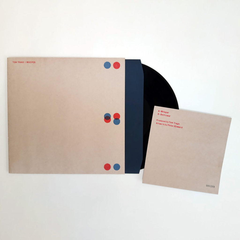
Tom Trago will launch Jong Nederland, his new label, with a new EP titled JNL01.
Jong Nederland is named after a historic building in Bergen, north Netherlands that has played host to artists and their families since the 1960s. It is here, within an artistic community by the sea, that Trago now lives and works.
The Jong Nederland label specializes in releases that “capture the immediacy and diversity of Trago’s daily music-making sessions,” we’re told. It was inspired by his desire to go back to basics and offer up raw, spontaneous, straight-to-tape tracks that capture the vibrancy of the moments he experiences while jamming with a limited range of hardware and electronic instruments. The label has no musical rules other than Trago’s desire to reflect the eclecticism of his productions.
The story begins with two tracks of undulating, slowly shifting dancefloor voodoo rich in crunchy drum machine hits, lilting electronic melodies, and dancefloor warmth.
On the A-side, you’ll find “Whisper,” a hypnotic but fluid affair where hushed melodies tumble down over off-kilter polyrhythmic machine drums, spaced out effects and bubbly, ever-changing analogue electronics.
B-side “Belltower” sees Trago up the tempo a little. Utilizing a rubbery rhythm track full of sturdy but supple kick-drums and hissing cymbals, Trago layers up fizzing synthesizer lines, poignant minor key chords, wiggling acid-style motifs, and starburst electronics to fire the synapses and stir the senses. Like its’ A-side companion, “Belltower” gently twists and turns throughout, “reflecting the real time, hands-on changes made by its creator during the spontaneous sessions that led to its creation,” the label adds.
Each Jong Nederland single is presented in handcrafted artwork designed by visual artist Pieter Bijwaard, a fellow Bergen resident who has been active since the early 1980s.
Tom Trago’s last album, Bergen, came in 2018, also inspired by his hometown.
Tracklisting
01. Whisper 02. Belltower
JNL01 EP is out on January 24. Meanwhile, you can stream clips of the release below.
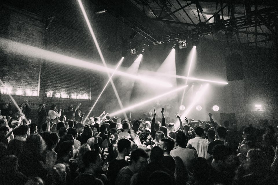
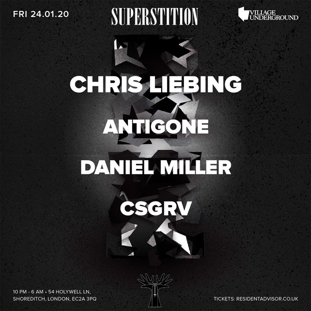
XLR8R is offering XLR8R+ subscribers free tickets to the upcoming Superstition party at Village Underground, London on Friday, January 24.
After making his debut at Village Underground in May 2018, Superstition is welcoming back one of the biggest names in Techno, Chris Liebing for an extended set. Alongside him will be Antigone, who has been at the forefront of the French techno scene for some time now, Daniel Miller and CSGRV.
Superstition is celebrating their 5th Birthday having made a solid impact on London nightlife with previous bookings including DVS1, Jeff Mills, Gerd Janson, Helena Hauff, and more. The setting is one of London’s staple nightclub, Village underground, set in a revamped warehouse once used to store shipping containers and tube carriages. It is the ideal environment to see some hard-hitting Techno.
For those who haven’t yet, just SUBSCRIBE HERE and email your full name with “Superstition” as the subject to [email protected] to claim your FREE pass. For those current subscribers, simply email your full name and “Superstition” as the email subject.
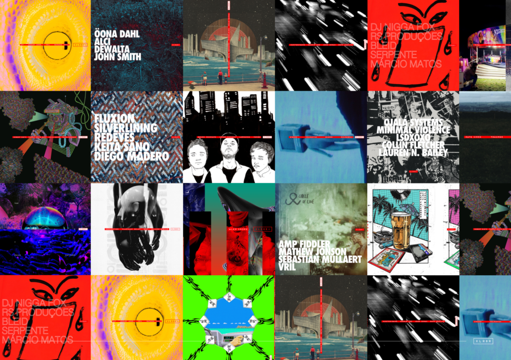
The latest edition of XLR8R+ explores Portugal’s thriving dance scene with tracks and content from DJ Nigga Fox, RS Produções, BLEID, and Serpente, plus artwork by Márcio Matos. Listen to snippets of the tracks below.